Sidebar navigation
This service pattern helps users to navigate between multiple tasks in a non-linear workflow.
What it is
A sidebar that shows all tasks in a workflow alongside the current task content, with status icons indicating progress. The sidebar is always visible, regardless of which task the user is working on.
It provides constant access to tasks. This pattern replaces the GOV.UK task list pages pattern in back-office workflows where officers need to return to the task list page to proceed to the next task. The previous workflow forced officers to work in a linear way and added extra clicking. This pattern was initially developed for pre-application assessment to assist planning officers to complete assessment tasks and build a pre-application advice report. The new pattern improves efficiency by reducing steps and clicks so that officers can spend more time on planning work rather than technical frictions.
When to use this pattern
Use sidebar navigation when:
Users need to see overall progress at a glance while working on individual tasks
The order of tasks is non-linear. It allows users to jump between tasks based on their preferred workflow and experience, not in a fixed order
The workflow involves multiple tasks. They can also be grouped into sections
Users handle cases across multiple sessions and need to quickly find where they left off
Speed matters. Users process many cases per day and need to minimise navigation clicks
When not to use this pattern
Do not use sidebar navigation when:
Tasks must be completed in a strict linear order. A step-by-step journey or wizard pattern is more appropriate
There are fewer than 5 tasks; a simple page with all fields visible may be sufficient
Users are unfamiliar with the system and need more guidance. The full-page task list gives each task more visual prominence and focus
Components
Structure
The sidebar navigation has three main parts:
Sticky headers: the GOV.UK header and BOPS header bar (showing the application reference, address, links to proposal description and Application information) stay pinned at the top of the screen. This means the officer always knows which case they're working on, even when scrolling through task content.
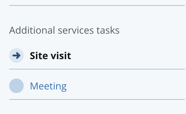
Sidebar: a fixed-width panel on the left showing all tasks grouped into sections. Each task has a status icon and a link. The currently active task is highlighted with bold text. If you have multiple tasks in the sidebar, you can group related tasks into a section
Main working space: the right area where the selected task's form or content is displayed. This area scrolls independently of the sidebar.
Status icons
Each task in the sidebar shows a circular status icon to the left of the task name. There are five statuses:
Not started —Light blue circle. The officer has not opened this task yet
In progress — Blue circle with arrow. The officer has started but not completed this task
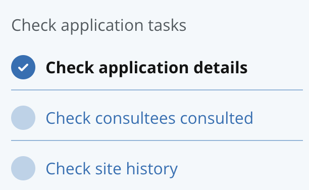
Complete — Dark blue circle with tick. The task is finished
Cannot start yet — Grey dashed circle with lock. A prerequisite must be completed first
Action required — Yellow circle with exclamation. Something needs the officer's attention (e.g. an applicant has responded to a request, received an amendment request from Reviewer.
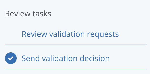
Stateless – The status icon can be hidden when the tasks don’t require progress tracking, they are non-actionable tasks, and for information only such as View consultee responses, Review validation requests.
Active task highlighting
The currently selected task is shown in bold text and marked with aria-current="page" for screen readers. This tells users exactly where they are in the workflow at all times.
Independent scrolling
The sidebar and main content area scroll independently. If the task list is long, the officer can scroll the sidebar without affecting the task form they're working on, and vice versa. The sticky headers remain visible above both panels.
Mobile behaviour
On screens narrower than 768px, the sidebar collapses into a horizontal menu bar above the content. An arrow button lets the officer expand and collapse the task list. This ensures the pattern remains usable on smaller screens, though the primary use case is desktop.
How it works
Tasks are usually actions that the user needs to take to complete a service. In a task list, the user is able to choose to complete tasks in any order that works for them.
The status icon alongside the task indicates whether they can start it. Users can select a task to start processing it.
Once they have started and clicked “Save changes”, the status for that task will change to “In progress”. Users can come back later to continue and complete the task.
Once they have completed the task and clicked “Save and mark as complete”, the status for that task will have changed to ‘Completed’.
Grouping tasks
Grouping tasks in the sidebar makes it easier to scan and helps users understand the structure of the service and prioritise their work more effectively. Tasks can be grouped into sections such as Check application tasks and Assessment summaries tasks
Show the status of the tasks
All tasks not started
When an officer first opens a case, every task shows the ‘not started’ status. This is the starting point for a new application.
Mixed progress
The most common state during active casework. Some tasks are complete, one is in progress (the current task), and others are waiting. Tasks that depend on earlier work show ‘cannot start yet’.
Action required
When the system needs the officer's attention, for example, an applicant has responded to a document request, the relevant task shows a yellow ‘action required’ icon. This draws the officer's eye to tasks that need intervention.
Tasks that cannot start yet
Some tasks depend on others being completed first. For example, ‘Send validation decision’ cannot start until all other validation tasks are complete. These tasks are not clickable.
Tasks complete
When a task shows a blue tick, it means the task was marked ‘Save and mark as complete’. Users can proceed to the next task or next stage.
How it differs from the GOV.UK task list
Pattern comparison
The GOV.UK task list was designed for services where users complete tasks one at a time in a guided flow. Planning officers work differently. They might check the description, realise they need to look at the documents, jump to the fee calculation, then return to the description. The sidebar keeps all of this visible.
Here is a list of elements from the BOPS pattern that differ from the GOV.UK pattern:
Layout
The GOV.UK task list is a full-page list; clicking a task navigates to a separate page. The BOPS sidebar lists tasks on the left sidebar separated from a content area on the right side, with independent scrolling.
Navigation
In the GOV.UK task list, users navigate away from the list to complete tasks. In BOPS, when a user moves to a different task the content updates in the same screen.
Progress visibility
In GOV.UK, progress is only visible on the task list page, not within the task. In BOPS, progress is always visible while working on any task.
Status indicators
GOV.UK uses text tags, such as ‘completed’ or ‘not yet started’. In BOPS, these are replaced by colour-coded circular icons which take up less space and worked well in testing with back-office users.
Context
With the GOV.UK task list, users lose sight of other tasks while working. In BOPS, the sidebar allows the user to see the status of all tasks, regardless of what they’re working on.
Suitable for
GOV.UK task list was designed for public facing, front end website to help users complete tasks step by step. With BOPS, we’ve adapted this component to work for back end systems and for case workers processing complex cases.
Research on this pattern
What prompted the change
BOPS originally used the GOV.UK task list pattern. Case officers reported two main problems:
Slow workflow: Officers had to scroll through the task list, click a task, complete it, navigate back to the list, find the next task, and repeat. For a validation stage with 14 tasks, this created significant friction. Officers described it as "clicking around too much."
Loss of overview: Planning officers don't work in a linear workflow. They might start checking the description, realise they need to verify a document first, then check a constraint before returning to the description. With the task list pattern, they lost sight of where they were in the process each time they entered a task.
What we learned
Officers told us the workflow feels faster. The reduction in page-to-page navigation means fewer clicks and faster process. Officers can move between tasks without the overhead of returning to a central list each time.
Non-linear work is supported. Officers can jump to any task at any time. The sidebar makes this feel natural rather than disorienting, because the full task list is always visible as a reference point.
Progress visibility helps officers feel in control. Seeing status icons for all tasks at once gives officers an immediate sense of how much work remains. They can spot tasks that need attention (yellow icons) and tasks they've already finished (blue ticks) without navigating anywhere.
The pattern is still evolving. The best way to visualise progress is an open question. Status icons work well for individual task status, but officers have also asked about section-level progress (e.g. "3 of 5 complete") and overall case progress. This is an area for continued exploration.
This is an evolving pattern: The sidebar navigation has been tested with planning officers and has proven effective for BOPS workflows, but it continues to be refined.
For information about any of our patterns, get in touch.