
Asking multiple questions at once
This service pattern is designed for expert users who complete familiar, regular and repeated tasks as part of their daily workflow.
What it is
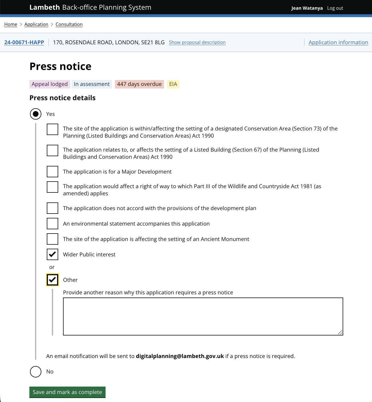
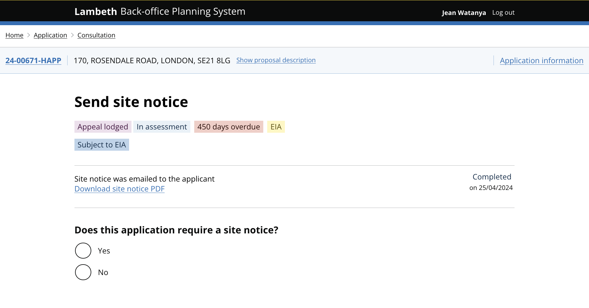
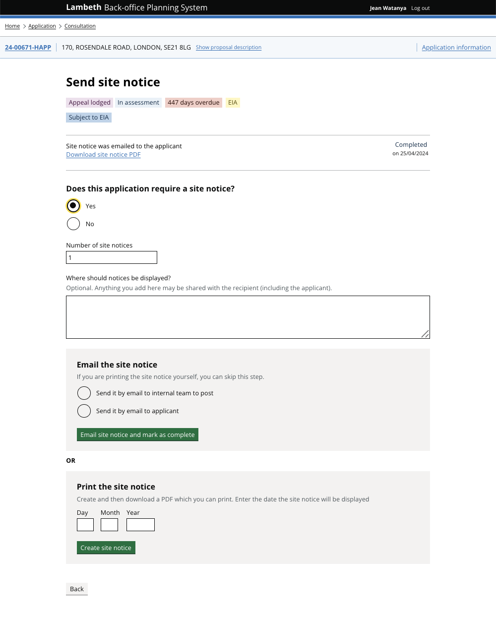
A pattern for back office services where related questions are grouped onto a single, high-density page rather than being split across separate pages.
This pattern is a deliberate change from the GOV.UK Design System recommendation to ask one question per page. One question per page is the right default for public facing services, where users are unfamiliar and don’t use a service often. Back office services often have a different audience such as expert Case Officers performing repetitive, conditional, high-frequency tasks. By showing related, familiar questions together, this audience can move through tasks more quickly.
When to use this pattern
Use this pattern when:
the service is internal or back office, not public facing
users are expert caseworkers who perform the same task many times a day
time saving matters: fewer clicks and page loads is a measure of productivity
the questions are closely related and a user needs to see them together to make a professional judgement
the domain is conditional. Some answers depend on or modify others, and showing them apart hides the relationships
users hold a strong internal model of the process and don't need step-by-step guidance through every question
When not to use this pattern
Do not use this pattern when:
the service is public facing. Use one question per page instead
users are infrequent or unfamiliar with the task and need time to understand each question
the questions are not related
having more than one decision per screen would make the task less accessible for some users (for example, users with cognitive load constraints completing the form for the first time)
the layout of questions isn’t well structured and the format of a page isn’t a clear visual grouping. High-density forms only work if structure and grouping are properly designed.
If in doubt, start with one question per page and only move to grouped pages once you have evidence from real users that the linear flow is slowing them down.
How it works
Use clear section headings
Each group of related fields gets its own heading and, where helpful, a one line hint. Headings turn a high-density page into something that can still be scanned in seconds.
Reveal conditional fields inline
When an answer triggers a follow-up question, show the follow-up immediately beneath the option that triggered it, never on a separate page. This keeps the relationship between the trigger and the dependent question visible.
Validate in place
Confirmations should appear at the top of the page and errors should appear next to the field they relate to. Expert users move fast and need feedback where they are currently working.
Allow saving partway through
Caseworkers are often interrupted. A ‘save changes’ option means a dense page never becomes a barrier to stepping away.
How it builds on ‘one thing per page’ pattern
The GOV.UK Design System notes that government users who switch between and repeat tasks frequently may be better served by seeing multiple ‘things’ or questions per page. We’ve built on this thinking with this pattern. This sections outlines the differences between using a ‘one question per page’ rule and a ‘multiple question per page’ pattern.
Layout
GOV.UK: One question per page; user clicks ‘continue’ between each
BOPS: Related questions grouped on a single page with section headings
Navigation
GOV.UK: Linear: Back / Continue between every question
BOPS: Single page; user moves through sections at their own pace
Cognitive load
GOV.UK: Minimised per screen, ideal for unfamiliar users
BOPS: Higher per screen, but reduced overall for users who already hold the mental model
Conditional questions
GOV.UK: Often shown on their own follow-up page
BOPS: Revealed inline beneath the trigger field
Speed
GOV.UK: Slower: many page loads per task
BOPS: Faster: fewer clicks, fewer page loads, fewer context switches
Suitable for
GOV.UK: Public facing services, infrequent users, unfamiliar tasks
BOPS: Back office services, expert users, repetitive conditional tasks
Research and learnings
Why this pattern fits BOPS workflow
Standard government design usually follows a ‘one thing per page’ rule. This approach is great for the general public because it makes the process simple: you answer one question, and if there’s a mistake, it’s easy to spot and fix before moving on. It reduces confusion and helps people finish a form without feeling overwhelmed.
However, through our work on BOPS (back office planning system), we found that the needs of professional planning officers are different. The UK planning system is complex and full of ‘if/then’ scenarios. For example, whether a homeowner needs permission often depends on several factors at once, like the building's height, its location, and whether it’s in a protected area.
Our research and testing led to these key insights:
Expert efficiency: Planning officers are ‘expert users’ who handle these tasks every day. For them, clicking through dozens of individual pages is slow and frustrating.
Seeing the big picture: Officers often need to see several pieces of information side by side to make a professional decision. If that information is split across different screens, it’s harder to connect the dots.
High-density workflows: We shifted to a high-density design that groups related questions together. This allows experts to work faster and more accurately by seeing the full context of an application in one page.
By moving away from a simple linear flow, we’ve created a workspace that matches the way planners actually think and work, without sacrificing the accuracy required for statutory decisions.
What we learned
Conditional, non-linear domains don't fit a single-question-per-page model. When the answer to one question changes which question comes next, splitting questions across pages forces users to mentally reassemble a structure that the interface has taken apart.
Time saving is critical for expert users. Caseworkers process many cases per day. Reducing the number of clicks and page loads per case is a productivity win, not just a nice-to-have. Users actively prefer denser pages once they have built a mental model of the form.
Experts need to see relationships, not next steps. An infrequent user benefits from being guided through a task, step by step. An expert user already knows the order. What they need is to see related data points side by side so they can make a professional judgement about how those data points fit together.
Density only works with structure. A high-density page without clear section headings, hints, and inline validation collapses into noise. The pattern depends on disciplined visual grouping.
This is an evolving pattern. Grouping questions has worked well for back office expert users, but the right amount of grouping is still an open question. Too dense and the page becomes a wall of fields; too sparse and you lose the benefit.
If you're considering this pattern for a different back office service, start with one thing per page, test with real users, and only group questions where you can show they belong together. For information about any of our patterns, get in touch.