
Showing key case information
This service pattern is designed for expert users who manage multiple cases as part of their day to day workflow.
What it is
A case details header bar which appears on every screen when a case officer is working within a specific case (the example image shows a planning application in BOPS). It gives case officers instant access to key information about the case; for example, reference number, address, and proposal description, without that information taking up space inside individual task pages.
When to use this pattern
Use the case details header bar when:
you are displaying a task or form that belongs to a specific case, such as a planning application
officers will be moving between multiple tasks within the same case/ application and need persistent context about which case they're on
the page layout already has a GOV.UK header at the top and you need an case-specific second tier below it
When not to use this pattern
Do not use this pattern when:
the page is not associated with a specific application (for example, a dashboard, search results, or admin pages)
you are showing a public facing page. This component is designed for back-office case officers, not applicants or members of the public
the application context is already prominent elsewhere on the page (for example, a full application detail page)How it works
How it works
Components
The bar is divided into three horizontal zones:
Reference and address (left) — the application reference number, shown in bold and linked to the application overview, followed by the full site address. These are always visible and cannot be hidden.
Description toggle (centre) — a ‘Show proposal description’ button that expands a panel below the bar to reveal the full proposal (or case) description. This lets officers check the description text at any point without navigating away. The button toggles between ‘Show proposal description’ and ‘Hide proposal description’.
Application information link (right) — a link to the full Application Information page, which opens in a new tab. This link can be hidden in specific contexts where it would be redundant or inappropriate (for example, when the officer is already on the application information page).
Description collapsed and expanded
On first load, officers see the description in a collapsed state. The proposal description is hidden; the bar shows only the reference, address, toggle button, and link.
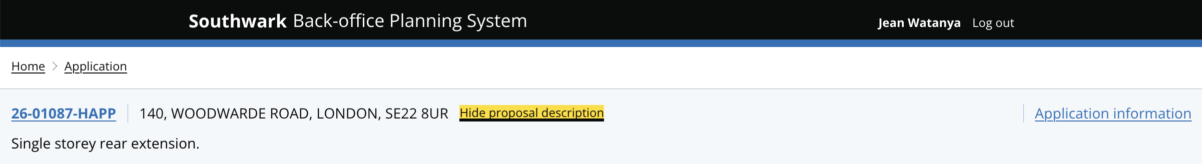

When an officer clicks ‘Show proposal description’, a panel opens below the bar with the full proposal text.
In context
The bar sits directly below the black GOV.UK header, forming a two-tier header stack above the task content. Both tiers are sticky; they remain pinned at the top of the screen as the officer scrolls through long task forms.
Sticky behaviour
The header bar is sticky to the top of the page. This keeps both the GOV.UK header and the application bar visible at all times. The sticky behaviour is also designed to stack on top of sidebar navigation and both of them stick to their position on the page.
Research and learnings
Why we updated this pattern
In the first iteration of BOPS we showed the full application details such as reference, address, description, and more at the top of every individual task page. This created two problems:
Officers had to scroll past the details to reach the task. On every page, they saw the same block of information before they could see other information.
The details were duplicated on every page. Each task page maintained its own copy of the same information. The team extracted this information into a single, dedicated bar that sits above the task content. Officers always know which application they're working on without losing any task space.
What we learned
Case officers found it very useful to have key application details on the header bar which they can refer to at all times. This also helps them work faster
Displaying just enough information could reduce ‘noise’ and helps users focus on the content better
The application reference number link is handy and useful for users to go back to the application landing page. Planning officers often work across two screens and refer to the application details regularly as they are working, so they found it helpful to be able to open it quickly.
This is an evolving pattern. For information about any of our patterns, get in touch.